The Psychology of Colors: How Color Theory Shapes Brand Perception in 2025


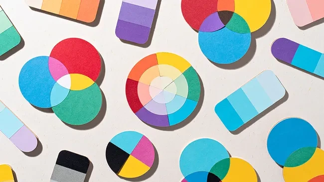
In today’s visually driven world, color plays a crucial role in shaping brand identity. Beyond its aesthetic appeal, color communicates emotions, conveys values, and influences how your audience perceives your business. Whether you’re designing a luxury website or creating brand visuals, understanding color theory is essential for creating a cohesive and impactful brand experience.
Colors have a profound impact on human behavior. Research shows that different colors evoke specific emotions and reactions. For example:
Blue inspires trust, professionalism, and reliability, making it a popular choice for corporate brands.
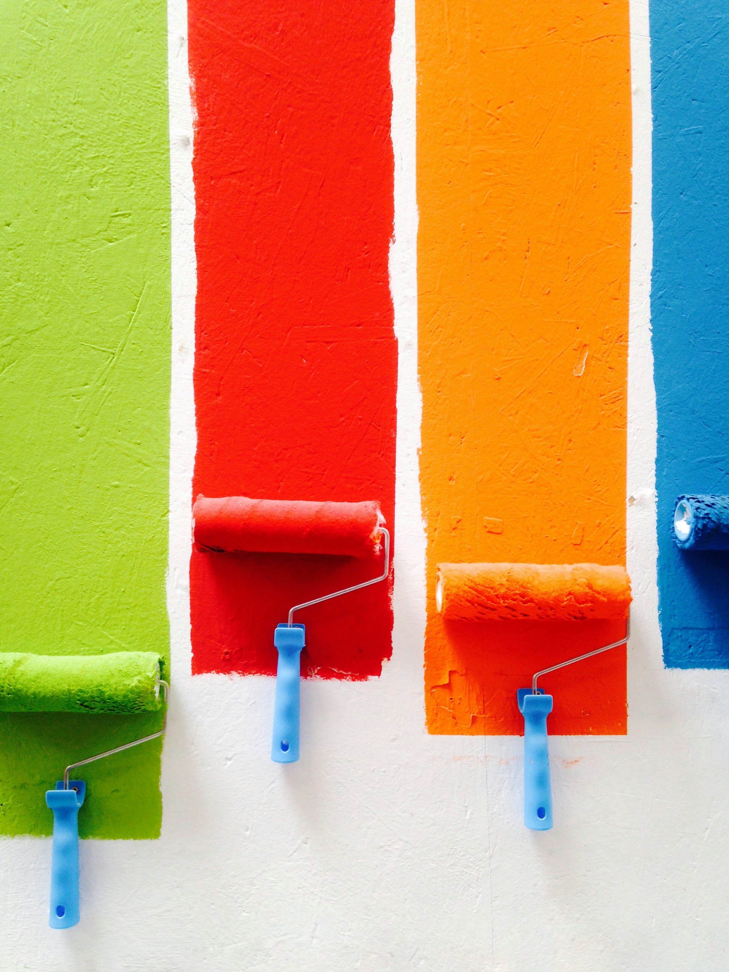
Red stimulates energy, passion, and urgency, perfect for industries like retail, marketing, and technology.
Green symbolizes growth, balance, and sustainability, appealing to eco-conscious consumers.
By strategically using the right colors, businesses can tap into emotional triggers that build deeper connections with their audience.
How Color Impacts Purchase Decisions
Studies indicate that up to 85% of shoppers make purchasing decisions based on color alone. For businesses, this means that a well-thought-out color scheme can lead to increased engagement and conversions. Whether it’s a call-to-action button or the overall color palette of a website, colors influence user experience and decision-making at every touchpoint.
Crafting Color Palettes That Tell Your Story
A cohesive color palette helps your brand stand out in a crowded market. Successful brands build their visual identity around specific color schemes that reflect their core values. Here are some examples:
Luxury Brands often use muted tones like black, gold, and white to convey sophistication and exclusivity.
Tech Companies often favor cooler tones like blue and gray to represent innovation and professionalism.
Sustainable Brands embrace earthy tones such as green, brown, and natural shades to emphasize environmental responsibility.
Avoiding Common Color Mistakes
Despite its importance, many businesses overlook color theory, resulting in poor design choices. Common mistakes include:
Overusing bold colors that can overwhelm users and reduce readability.
Ignoring cultural color meanings, where colors may have different interpretations across regions and markets.
Neglecting accessibility, such as ensuring proper contrast ratios for visually impaired users.

Trends in Color Theory for 2025
As we move forward into 2025, color trends continue to evolve to meet modern design needs:
Soft and Muted Tones are becoming increasingly popular for creating calming and welcoming user experiences.
Dark Mode-Friendly Palettes are essential for websites and apps designed to offer minimalist, sleek designs with accessibility in mind.
Gradient Overlays are being used more frequently to add depth, fluidity, and movement to designs.
Work with us